Backpacking Icons
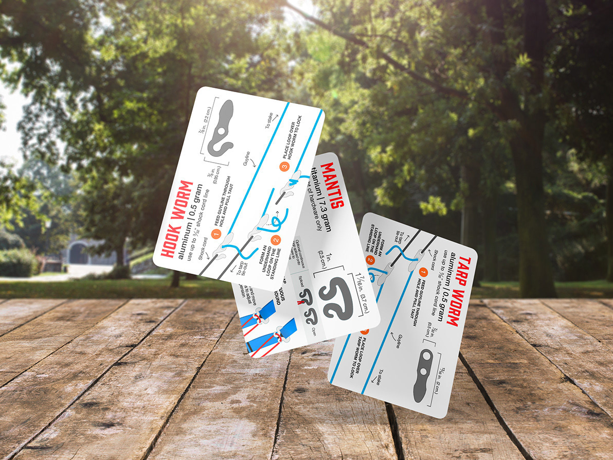
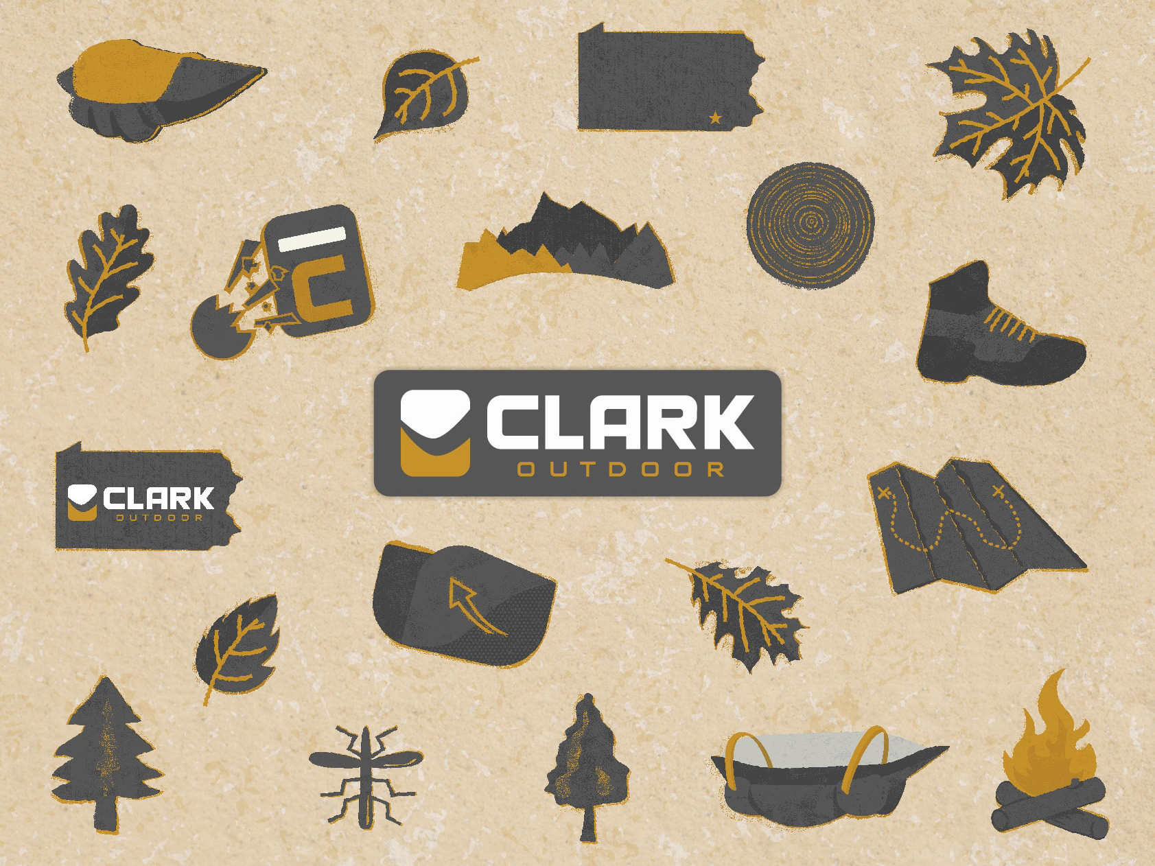
Consistency and clarity are paramount when users only give you a fraction of a second before their attention is diverted elsewhere. In designing these icons, our goal was to create easily distinguishable icons and a simple color, and texture system. Users can expect similar icons to be orientated in the same way when accessories are paired, making for a quick decision-making process. Additionally, we intended to make these legible at a small size, so paying attention to line thickness and form during scaling helped us achieve this successfully.


